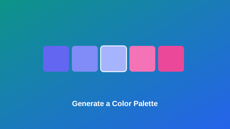
You've got one color locked in — a brand color, a logo's main shade, something a client already approved — and now you need four or five more that actually work with it. Guessing at shades in an image editor rarely produces anything that looks intentional, and scrolling through palette inspiration boards almost never turns up something built around the exact color you're stuck with.
This guide covers how color harmony actually works, what each of the five palette styles genuinely does to your base color, and how to pick the right one for whatever you're actually designing — a brand system, a UI, or a one-off graphic that just needs to not look thrown together.
What a Color Harmony Actually Is
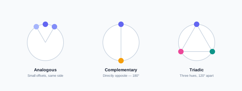
Every color harmony is really just a rule about angles on a color wheel. Colors can be described by three values: hue (its position on that wheel, from 0 to 360 degrees), saturation (how intense or muted it is), and lightness (how close it sits to black or white). A "harmony" is a mathematical relationship between hues — a fixed angular offset that tends to look intentional and balanced to the eye, rather than an arbitrary pairing.
My PDF's Color Palette Generator builds a palette by taking your base color's hue and applying exactly this kind of offset, entirely in your browser. Pick a color, choose a harmony, and the resulting palette isn't a guess — it's the same angle math a trained designer would apply manually, done instantly.
The Five Palette Styles, Explained
This is the part most quick tutorials skim past, and it's the actual decision that determines whether your palette fits what you're building.
Analogous
Analogous colors sit close together on the wheel — small offsets in both directions from your base hue. They share enough in common to feel naturally cohesive, with low contrast between them. This is the safest starting point for a palette that needs to feel calm and unified rather than punchy: backgrounds, gradients, or a family of brand colors meant to read as "the same idea" in different moods.
Complementary
Complementary colors sit directly opposite your base hue, 180 degrees around the wheel. This produces the highest possible contrast between two colors, which makes it excellent for drawing attention — a call-to-action button against a brand-colored background, for instance — but risky to use in equal proportions across a large area, since that much contrast can read as visually loud rather than intentional.
Triadic
Triadic palettes use three hues spaced evenly around the wheel, 120 degrees apart. It's vibrant and balanced by construction, but it works best when one of the three colors clearly dominates and the other two act as accents — using all three in equal weight tends to compete for attention rather than working together.
Monochromatic
A monochromatic palette keeps the same hue and saturation throughout, varying only the lightness. It's the most cohesive, lowest-risk option of the five, and it's particularly useful for anything that needs a range of shades of one specific color — button states, backgrounds, borders — without introducing a second color into the mix at all.
Shades & Tints
This one is closely related to monochromatic, and worth being precise about the distinction. Both vary lightness around the same hue and saturation; the difference is how the steps are built. Monochromatic here generates a descending run of lightness values. Shades & Tints instead steps symmetrically both darker and lighter than your exact base color — genuine shades (darker) and tints (lighter) of the specific color you picked, rather than an independent lightness ramp. In practice, it's the better choice when your base color itself needs to stay visible in the final palette, unchanged, with darker and lighter variants built around it.
| Style | Relationship to base hue | Best for |
|---|---|---|
| Analogous | Small offsets, same side of the wheel | Cohesive brand families, calm backgrounds |
| Complementary | Opposite (180°) | High-contrast accents, calls to action |
| Triadic | Three hues, 120° apart | Vibrant schemes with one dominant color |
| Monochromatic | Same hue and saturation, varying lightness | UI states, button variants, backgrounds |
| Shades & Tints | Same hue and saturation, base color preserved with symmetric light/dark steps | Design systems needing your exact base color plus a light-to-dark range |
How to Generate a Color Palette, Step by Step
Step 1: Open the Color Palette Generator
Go to My PDF's Color Palette Generator. No installation or account needed.
Step 2: Choose Your Base Color
Use the native color picker to select your starting color. If you already have an exact brand hex code, most browsers let you type it directly into the picker rather than eyeballing a match visually.
Step 3: Pick a Harmony Style
Choose Analogous, Complementary, Triadic, Monochromatic, or Shades & Tints, based on what you're actually building — see the breakdown above if you're not sure which fits.
Step 4: Copy the Resulting HEX Codes
The palette updates instantly, with each color's HEX code ready to copy directly into your CSS, design tool, or brand guidelines.
Practical Examples
Building a five-color brand palette from one existing color. You've got a logo's primary color locked in and need a small supporting set for a new website. Analogous keeps everything feeling like part of the same family, without introducing a jarring contrast anywhere in the design.
Choosing an accent color for a call-to-action button. Your brand color is already set as the background; you need a button that visually stands out against it without clashing. Complementary, used just for that one accent rather than across the whole page, does exactly this.
Creating UI state colors from a single primary. Hover states, active states, disabled states — all variations of one brand color at different lightness levels. Monochromatic generates exactly this kind of ramp in one pass.
Designing a vibrant three-color scheme for an event or product launch. Triadic gives you three balanced, energetic colors — just remember to let one dominate the design, with the other two used more sparingly as accents.
Common Mistakes When Building a Color Palette
Using a complementary palette in equal proportions. High contrast is the point of complementary colors, but spreading two opposing hues evenly across a large layout usually looks chaotic rather than intentional — reserve the second color for accents.
Treating all three triadic colors as equally weighted. Without a clear dominant color, a triadic palette tends to compete with itself. Pick one to lead, and use the other two more sparingly.
Assuming monochromatic and Shades & Tints are dramatically different. As covered above, both vary lightness around one hue and saturation — the real difference is subtle, not a fundamentally different formula. Shades & Tints preserves your exact base color in the output; Monochromatic generates its own independent lightness run.
Skipping a contrast check on text-and-background pairings. A palette that looks pleasant as isolated swatches can still fail basic readability once one color becomes body text on top of another. Always test any color pair you're using for text against its actual background before finalizing anything.
Judging a palette from swatches alone. Small color chips in a row look different from the same colors applied across real buttons, headers, and backgrounds. Drop the palette into an actual mockup before committing to it.
Tips & Best Practices
- Start from a color you're already committed to, not one picked arbitrarily — a real constraint (an existing logo, brand guideline) makes the resulting palette immediately useful rather than just interesting.
- Use complementary and triadic colors as accents, not equal partners. Reserve the strongest contrast for the parts of a design that should actually draw the eye.
- Reach for monochromatic or Shades & Tints for systematic UI needs — button states, hover effects, borders — where consistency matters more than variety.
- Check contrast before finalizing any text-on-background pairing. A visually appealing palette isn't automatically a readable one.
- Copy HEX codes straight into your CSS or design tokens rather than re-picking colors by eye later — it keeps the palette consistent everywhere it's used.
Key Takeaways
- Every color harmony is a fixed angular relationship on the color wheel — the palette generator applies the same math a designer would use manually.
- Analogous suits cohesive, calm designs; Complementary and Triadic add contrast and energy but work best used unevenly, with one color leading.
- Monochromatic and Shades & Tints are closely related, both varying lightness around one hue — the difference is whether your exact base color is preserved in the output.
- Always check text-on-background contrast before finalizing a palette, since visually pleasant swatches don't guarantee readability.
- Start from a color you're already committed to, so the resulting palette is immediately usable rather than just an interesting set of swatches.
Related Reading
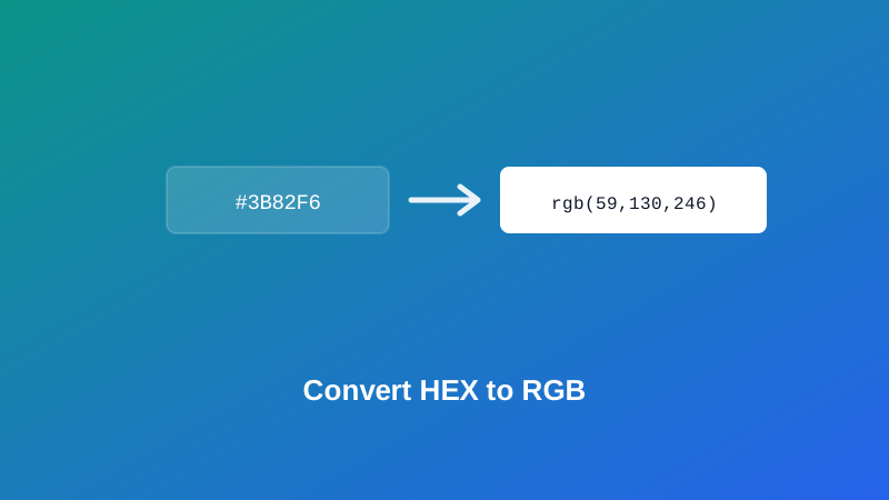
If you need to convert a single color between formats rather than build a full palette, HEX to RGB and Color Picker handle that directly. If your finished palette is going into a printed brochure or one-pager, exporting the design to PDF and checking it against a standard paper size with Resize PDF is a sensible last step before it goes to print. For more guides like this one, browse the full blog or the complete tools directory. For a deeper look at color theory and how these harmonies are traditionally used, see Wikipedia's entry on color scheme.
Got a base color and need the rest of the palette? Open the Color Palette Generator and get a full set of matching HEX codes in seconds.

Comments
Comments aren't open on the blog yet. In the meantime, share this article using the buttons above, or reach us directly at contact@mypdf.tech.